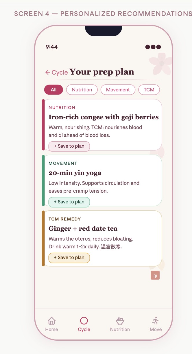
A prediction tells you when. A plan helps you decide what next.
DivaFlo explores the space between knowing a period is coming and knowing how to prepare for the day.
Cycle tracking, symptom notes, and everyday wellness decisions often live in separate places. The concept brings them into a single flow, with food, movement, and rest options inspired in part by Chinese wellness traditions.
Five college women, ages 19–20, interviewed in June 2026. These are exploratory findings from a small convenience sample, not population estimates.
FROM RESEARCH TO THE FIRST PROTOTYPE
A busy day was the design constraint.
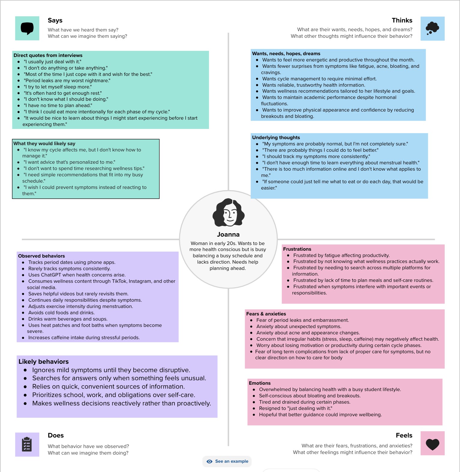
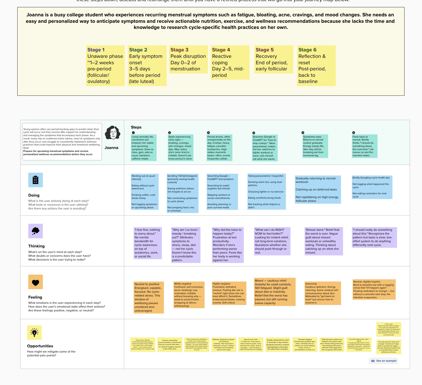
The composite persona, Joanna, needed guidance that fit around a full student schedule. The empathy map separates observed behavior from inferred thoughts; the journey map shows where intentions faded before the next cycle.
The opportunity was to make preparation easier to find, easier to save, and easier to revisit.
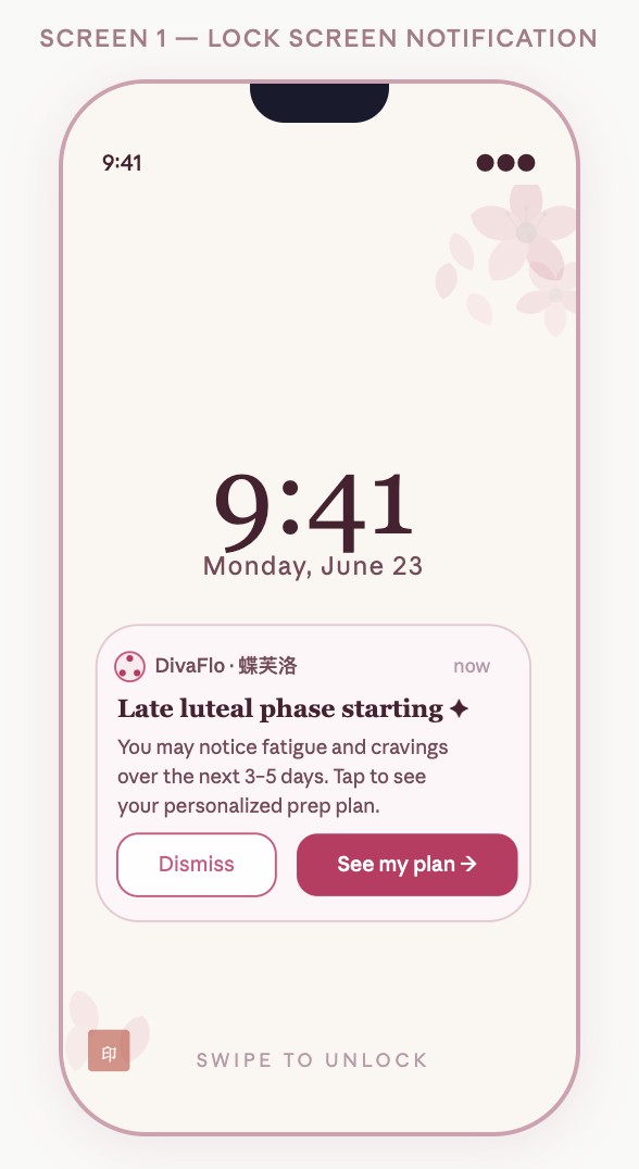
Before symptoms: Make a phase update visible without requiring a search.
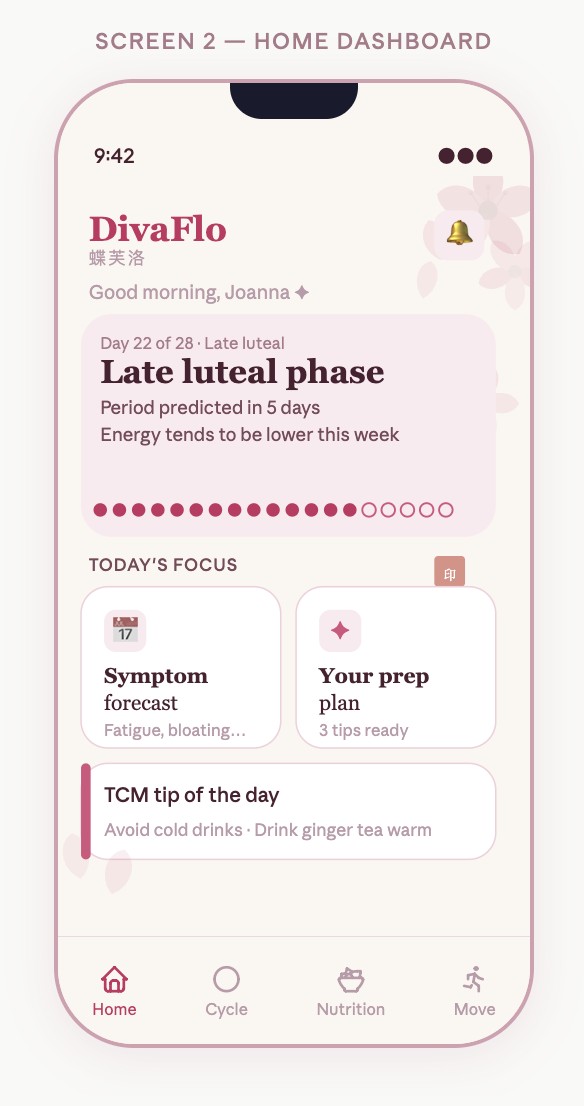
When plans are disrupted: Put food, movement, and wellness options together.
After choosing an option: Confirm the save and keep the plan accessible.
Explore the original empathy mapExplore the original journey map
01 · A prompt to prepare02 · A clear starting point03 · Options in one place
Original course artifacts. The interactive portfolio demo above extends this work with responsive logging, complete recipes, and updating save counts.
03 / TURN INSIGHT INTO AN ACTION
One need. Two distinct paths.
01
“Log symptoms” records.
Named symptoms, labeled intensity, and an explicit save action make it clear that this path captures how someone feels.
LESS EXPLICIT
How are you? 😊 😐 😣
MORE EXPLICIT
What are you noticing? Cramps · Low energy · Bloating
02
“See My Plan” supports action.
A separate, prominent action takes visitors to practical options. Short explanations make the relationship between an input and the sample plan visible.
FROM INFORMATION
Your next period is approaching.
TO A CLEAR NEXT STEP
Explore a gentle movement option. See My Plan
03
Show what changed.
Logging should visibly update the experience. The demo acknowledges a saved entry, reflects it on Today, and explains the plan’s selection rules.
CONFIRM THE ACTION
Symptoms saved for this visit.
MAKE THE REASON VISIBLE
This lower-effort option appears because you selected low energy.
The copy comparisons above are illustrative rewrites in this portfolio version, not archived screenshots of the original prototype.
04 / TEST, LEARN, REVISE
Feedback became a design decision.
Two think-aloud participants immediately understood the concept and chose “See My Plan” first. Their sessions also revealed specific gaps between what the interface promised and what it actually did.
OBSERVATION
Logging did not visibly change the plan.
Observation: One tester looked for the logger under the forecast, then expected a change after saving. Refinement: Separate “Log Symptoms” from “See My Plan,” confirm the save, and show the logged inputs in the plan.
OBSERVATION
Food tips were missing the next step.
Observation: A tester expected a complete recipe. Another expected named responses rather than emojis. Refinement: Add ingredients and methods to recipe details and use text labels for symptom selection.
OBSERVATION
Saved progress stayed at “1 of 3.”
Observation: Both testers noticed that progress did not reflect saved recommendations. Peer critique also asked for a clearer saved state. Refinement: Update the saved count immediately and preserve the selected state on each card.
WHAT I CAN CLAIM
Two think-aloud sessions revealed navigation, feedback, and content gaps. The portfolio refinements have not yet been re-tested, so their effect on usability remains unmeasured. No clinical, retention, or conversion outcome is claimed.
05 / WHAT I WOULD TEST NEXT
Can someone move from a feeling to a useful next step?
The next test should evaluate comprehension and task completion, rather than whether the interface looks finished.
Can someone log low energy without confusing logging with viewing advice?
Can they explain why a sample option appears in their plan?
Can they find a recipe, understand its steps, and save it?
Do they understand the difference between cultural inspiration and evidence-backed medical guidance?